Fundación Barrié,
exhibition design .
Project summary
Designing an exhibition's journey is designing an experience.
An exhibition is not a collection of artworks hung on walls.
An exhibition is a journey: the visitor enters at one point, moves through a physical space with real constraints — columns, wall heights, access points, emergency exits — and needs to leave having understood something. The works cannot be read in any order or at any distance. Space conditions reading in the same way a layout conditions reading on a page.
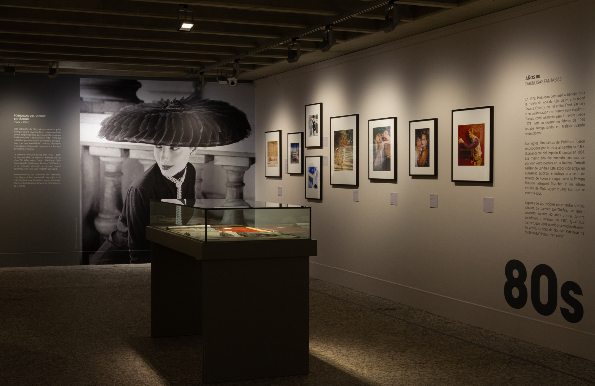
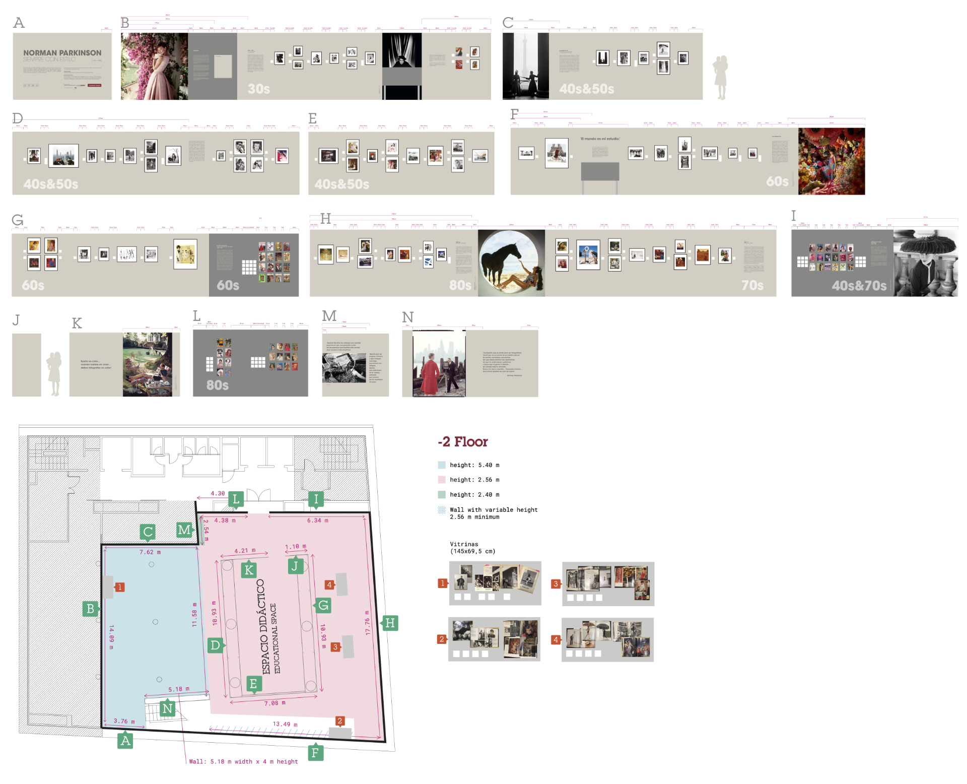
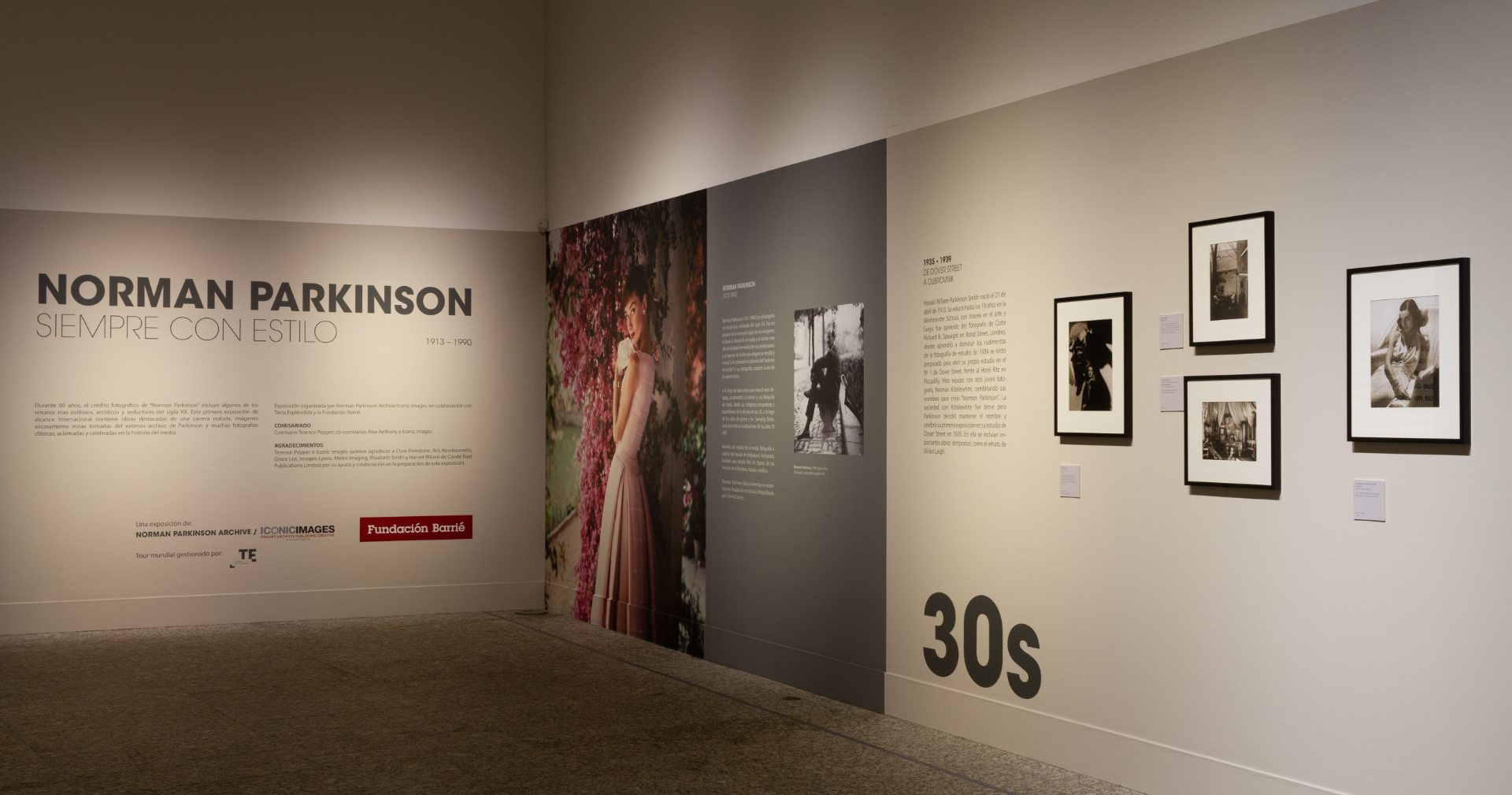
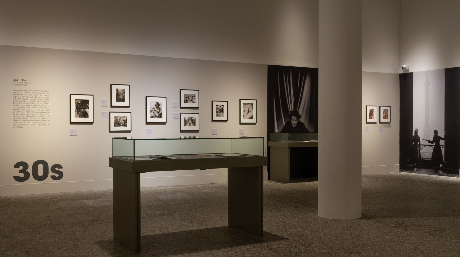
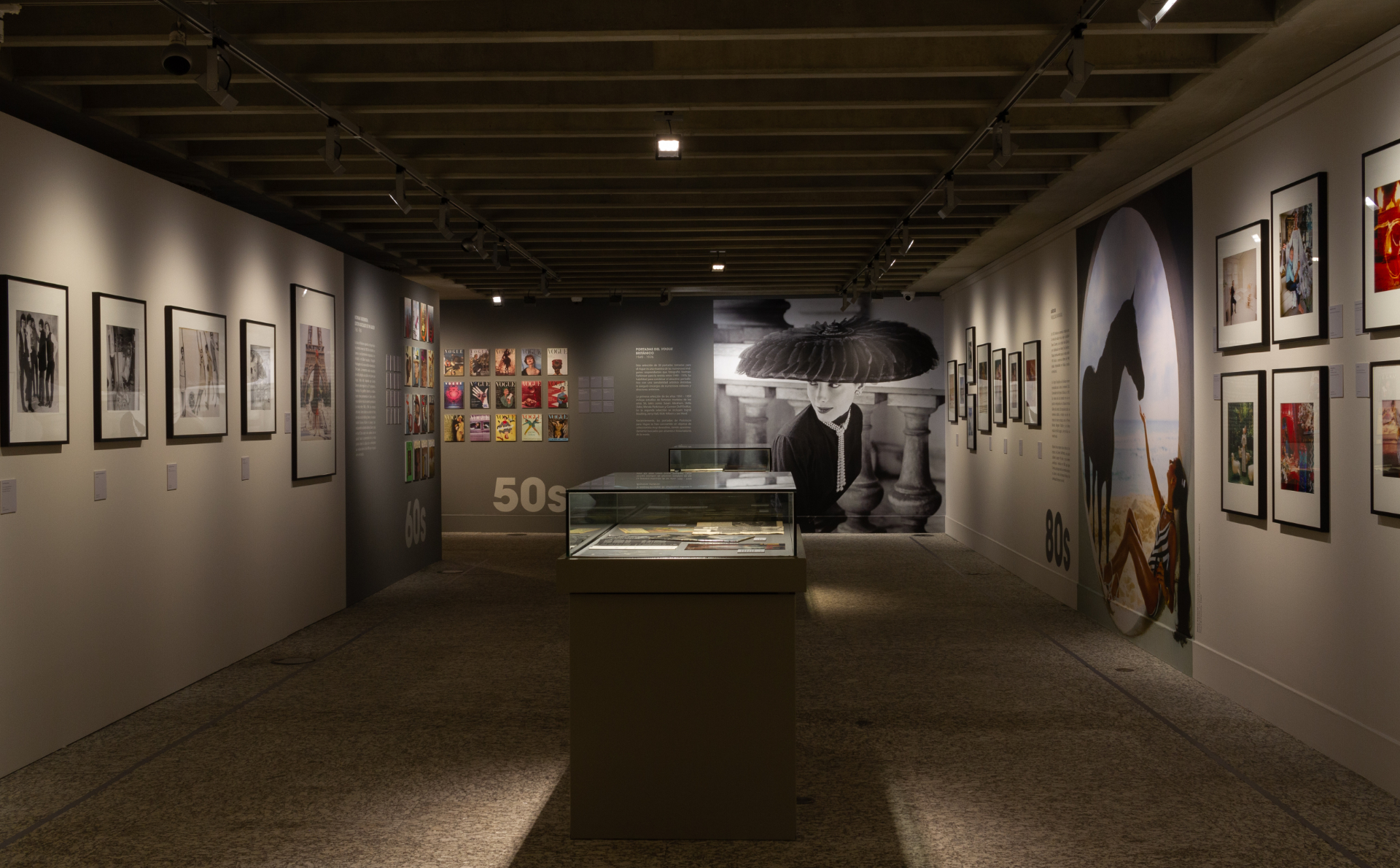
In Parkinson's case, the exhibition was organised chronologically by decade — from the 1930s to the 1980s — and the available space was level -2 of Fundación Barrié: a rectangle with perimeter walls of varying heights and interior partitions.
The question was the same as in any digital product: how do I guide the user through a complex flow as naturally as possible?
Floor plan, rhythm, signage, brochure.
The work began with the floor plan. Each wall had an identifier (A–N) and fixed dimensions. Over that physical grid I distributed the 80 works, grouping them by period, alternating large and small formats to create visual rhythm and controlling density by zone: the first walls more open so the visitor enters at ease, the central ones denser where there is already momentum, and the final ones airy again to close.
The text vinyls — section titles, quotes, credits — were placed as navigation cues. They are not decoration: they mark transitions between decades and guide visitors who look up from the photographs.
The brochure served a dual purpose: a hand guide during the visit and an editorial piece that outlives the exhibition. I designed it bilingually (Spanish and Galician) with key reproductions from each period and the curator's texts.
The communication pieces derived from the same visual system as the brochure, maintaining brand coherence with Fundación Barrié's identity.
Designing the space where someone will see for the first time a photograph of Audrey Hepburn taken in 1955 carries a responsibility and a satisfaction unlike anything else.
Decisions.
-
Linear chronological journey, not thematic.
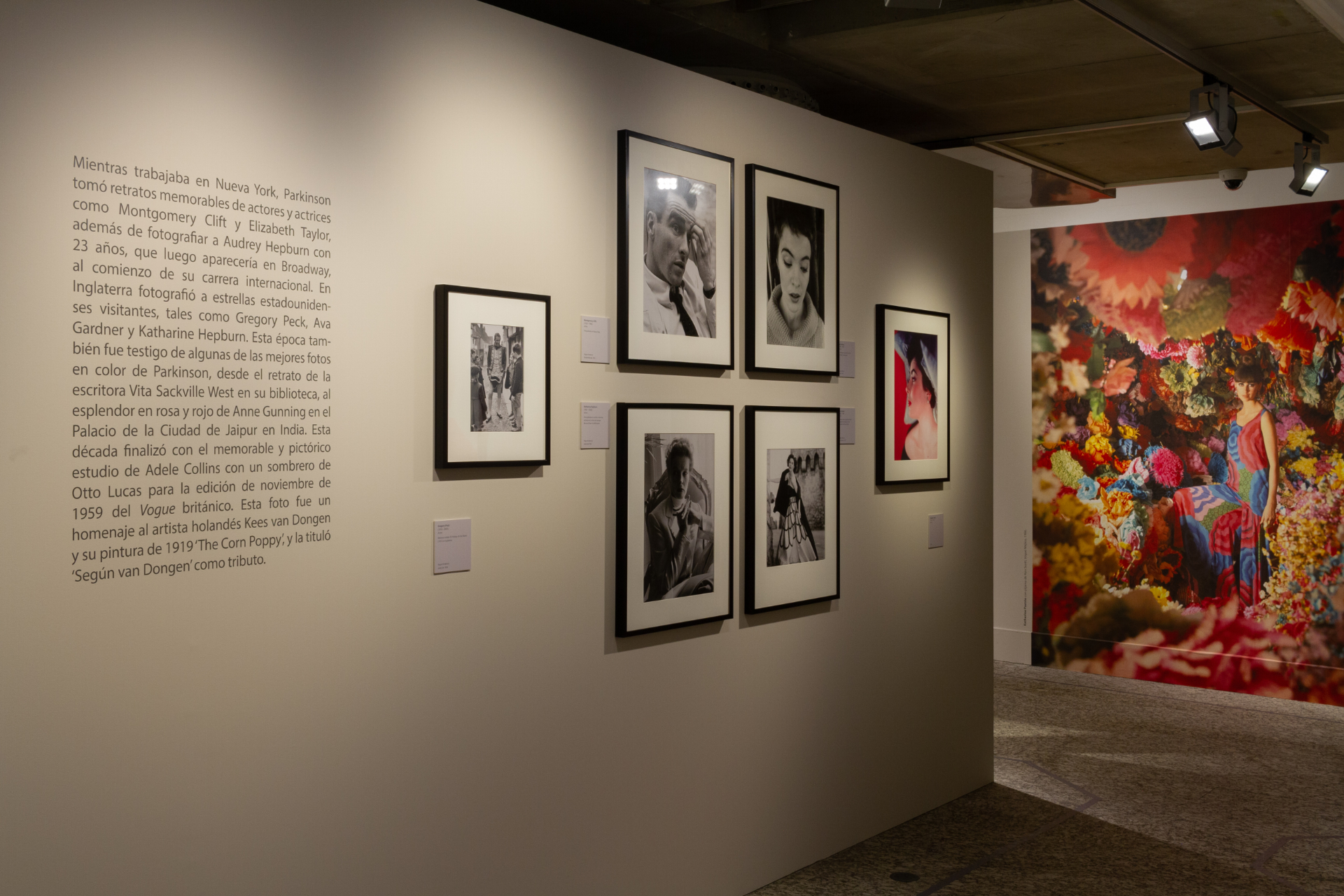
Parkinson's work is best understood as an evolution: the experimental 1930s, the 1940s and 50s with Vogue, the vibrant 1960s with The Queen and the Beatles, the 1970s–80s with Town & Country. Breaking that line by theme would have lost the narrative of a 56-year career.
-
Variable density as a rhythm tool.
Walls A–C (1930s) with fewer works and more breathing room. Walls D–H (40s–60s) denser, where the visitor has already reached cruising speed. Walls I–N more open to close. The same principle as applying more white space at the top of a landing page.
-
Hanging heights calculated per wall.
The tall perimeter walls allowed large pieces with generous viewing distance. The low interior partitions required smaller formats or group compositions. Each wall had its own logic within the space.
-
Bilingual brochure as a standalone piece.
It is not a catalogue: it does not reproduce all 80 works or aim to replace the visit. It selects the pieces that represent each period and works as an independent editorial object.
-
Shared visual system across media.
Brochure, gallery vinyls, communication pieces: everything comes from the same typographic and colour palette. The exhibition reads the same inside and outside the walls.
Personal value.
Of the commissions for Fundación Barrié, exhibition design was the most complex from a design standpoint. In addition to the Norman Parkinson exhibition I also designed three others: Miró, Chagall and Old Master Drawings (works by Dutch and Flemish artists from the 16th to the 19th century).
These four projects shared something not found in every commission: working to bring culture to the public. Designing the space where someone will see for the first time a photograph of Audrey Hepburn taken in 1955, or a drawing by Chagall, or a piece by Rembrandt, carries a responsibility and a satisfaction unlike anything else.