Visual MS,
identity redesign .
Project summary
The redesign that needed consensus before design.
Two brands under the same umbrella.
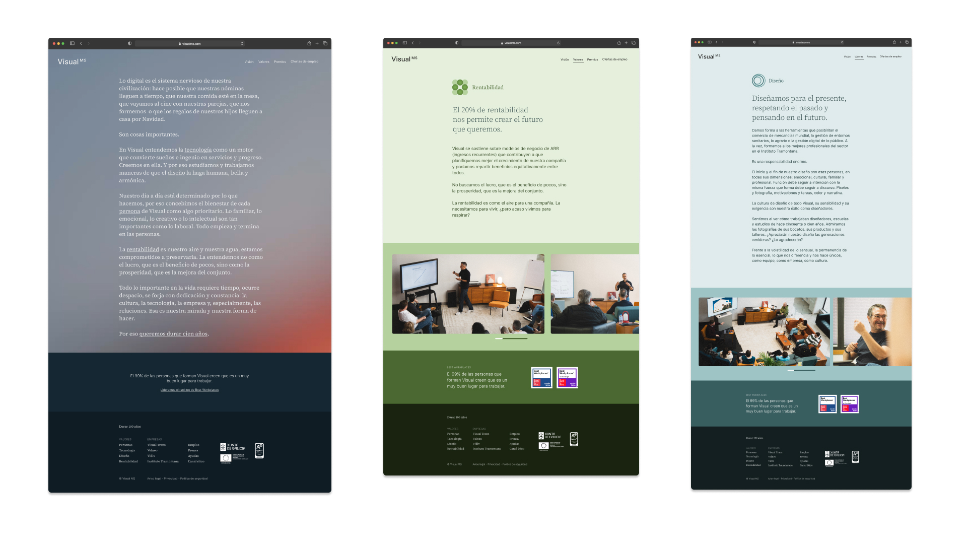
The incorporation of Instituto Tramontana into the Visual MS group created an identity tension that was hard to ignore. Under the Visual MS umbrella coexist Velneo, Instituto Tramontana, Visual Trans, vForwarding, Vidiv and Reserva Entradas. Tramontana had a humanistic and emotional approach, focused on people. Visual MS, on the other hand, had built its identity on the practical and minimalism, an aesthetic that over time had evolved into something too cold. The group brands couldn't coexist without resolving this contradiction, and the objective was to establish visual foundations that would also facilitate the integration of new companies — part of the business strategy.
It wasn't the first time a redesign had been attempted. Previous attempts had failed to get stakeholders aligned around the same direction.
Consensus before design.
As Design Lead, my role was creative direction and project management: establish the process, reduce friction and build progressive agreements with all stakeholders. Design execution was handled by Iria Maceira, whose work was fundamental in bringing the system to completion.
This time the process was as important as the result. Before proposing, we agreed on how we were going to work: which decisions were made as a group, which in creative direction, and at what stage proposals were reviewed.
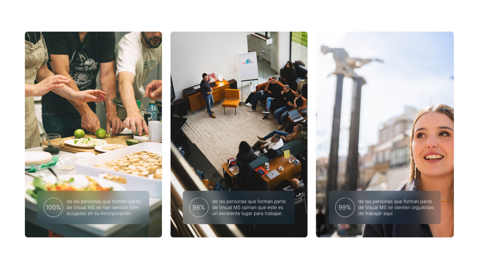
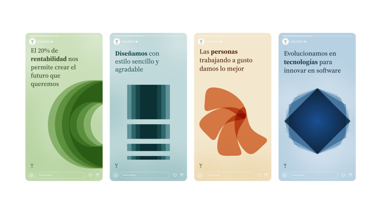
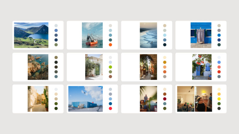
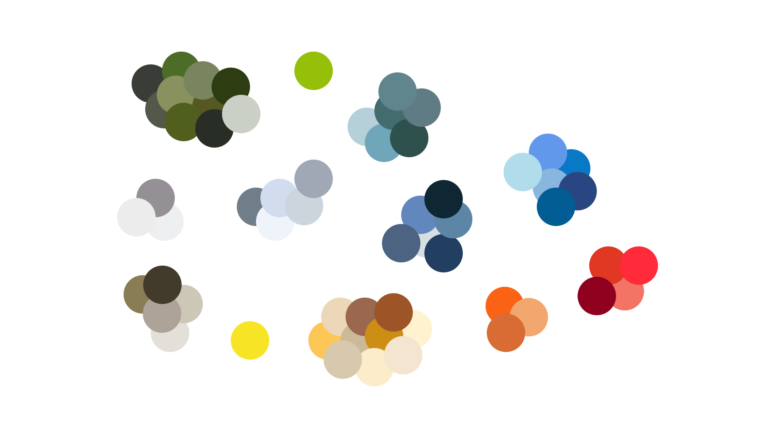
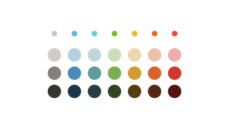
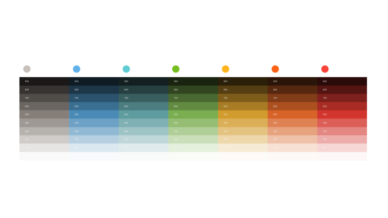
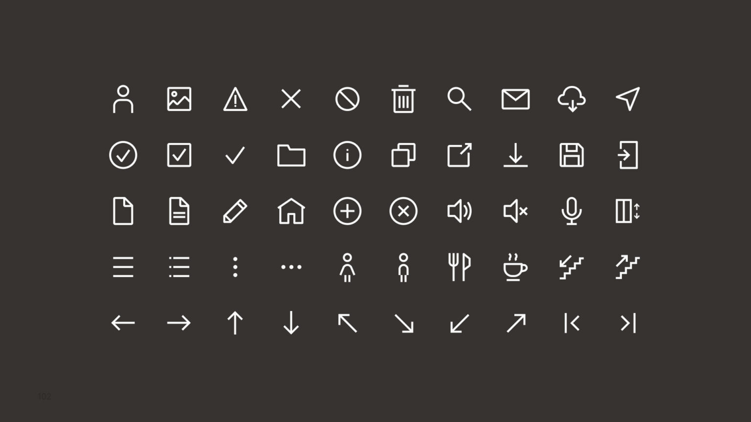
The color started from the territory shared by Galicia, Asturias and the Mediterranean — from which Instituto Tramontana draws —, with a palette extracted from those landscapes. Typography, Inter and Source Serif, was chosen based on real usage criteria: both on Google Fonts, available throughout the group without depending on external licenses. Icons were designed on a 32×32 pixel grid with 2 px stroke.
The most significant decision was not to change the logo.
Decisions.
-
Process before result.
Establishing how we were going to work was part of the project. Building progressive agreements with all stakeholders required as much work as the design itself. Reducing friction wasn't about smoothing conflict: it was giving it a place where it needed to be.
-
Not changing the logo.
We explored and discarded external proposals that didn't understand the brand. The conclusion required convincing people with very different criteria, but it was the most significant decision of the project.
-
The color of shared territory.
Galicia, Asturias and the Mediterranean — from which Instituto Tramontana draws — are the physical territory of the group. The palette was extracted from those landscapes: a decision with geographical origin, not aesthetic taste.
-
Typography based on real usage.
Inter and Source Serif, both on Google Fonts, available throughout the group without depending on external licenses. Inter represents the practical approach; Source Serif is the more human and emotional counterbalance. The first criterion was system; the second, voice.
-
Icons with mathematics.
32×32 grid with 2 px stroke. When scaled to 24 pixels, the stroke becomes 1.5 px — a visual balance that makes them precise without being heavy.
What remained.
The resulting system was built on decisions with their own logic. Each choice — color, typography, icons and an intact logo — stands on a concrete argument, defensible separately, and all were presented to stakeholders with the same criteria.
All group divisions now coexist under the same umbrella without betraying what each brand had been. The tension between human and practical wasn't resolved by erasing it: it became part of the system. And the foundations are prepared to integrate the companies that are coming.